Reports in the Role Tailored Client require the use of RDLC layouts. RDLC is pretty powerful anyway, but there are some features of RDLC reports that are barely used in standard NAV:
- Document Map
The document map allows you to see a summary of the content in the report. It also functions as a list of links, allowing you to navigate to specific sections of the report. This feature is useful for navigating large analysis reports.
- Page Hyperlinks
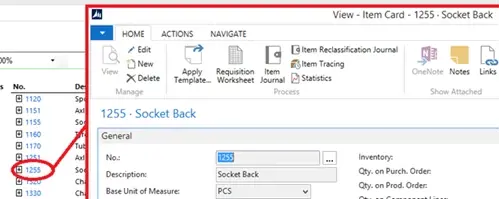
Page Hyperlinks allow us to view pages in NAV from the report. In our example, we have links directly to the Item card from within the report. Theoretically you could put any kind of link in here, not just to specific NAV pages, but also filtered lists, other reports, web pages and e-mail addresses. Hyperlinks remain functional when the report is printed to PDF. This could be useful for placing clickable e-mail addresses and web pages within email attachments, NAV-based links (such as linking to the Customer Card) and even telephone number links for Skype For Business.
- Collapsible Detail View
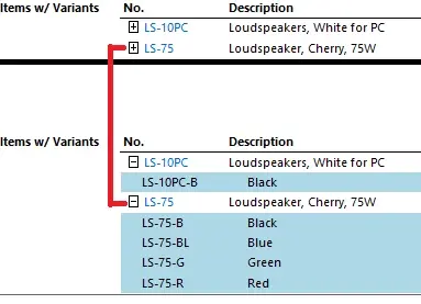
Alongside the Item links, you’ll notice a small plus symbol [+]. This represents collapsible groups of data. Like the Document Map, this can be used to summarise potentially large groups of data to make the report easier to navigate. In addition, groups that are collapsed count as hidden and won’t be printed in the report, offering a much finer control over the report and reducing the need for conditional flags on the request page (such as ‘Show Comments’). In our example we can decide whether we want to show the variants for each item, given that we’ve grouped items by whether they have variants or not.
- Interactive Sorting
Interactive sorting allows you to sort groups with specified fields on the report layout. It’s a simple feature but it allows for finer control over the report output.
A small up-down arrow will appear against the sortable field. In our example, we’ve chosen to be able to sort our Item groups by Description.

- Graphs and Charts
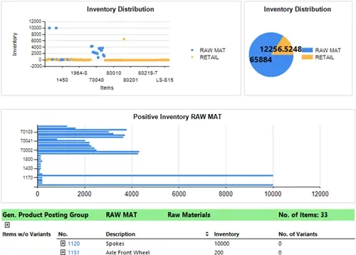
One of the most useful features of RTC reports is graphs. Graphs are a great way to summarise data in a report from within NAV. They are highly customisable and are available in a range of types (such as pie chart, bar chart, scatter chart, etc). In our example, we have a scatter graph displaying the distribution of inventory by item, a pie chart showing the distribution of inventory by Gen. Product Posting Group and a bar chart that shows all the Items per Gen. Product Posting Group that have a positive inventory. The scatter and pie charts are in the header and show data across the entire report, whereas the bar chart is grouped with the lines.
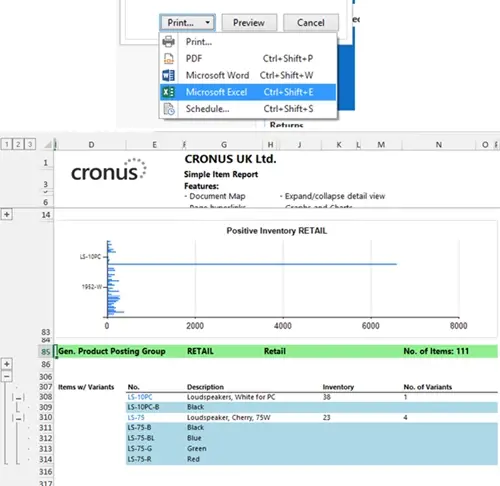
- Exportable to Excel and PDF
Finally, all of this functionality is retained when the report is printed to Microsoft Excel. When printed to PDF, you still get graphs (which are saved as images) and hyperlinks.
Click here for an example of what the report looks like when printed to Microsoft Excel.
Click here for an example of the what the report looks like when printed to PDF.

Jesse Lawrence
Jesse is our marketing manager, keeping an eye on the latest news in the market as well as having worked on the GDPR legislation.

 Jesse Lawrence


